You’re reading Signal v. Noise, a publication about the web by Basecamp since 1999. Happy !

Signal v. Noise: Design

Our Most Recent Posts on Design

How Inventables makes a site that inspires exploring

Matt Linderman
Matt Linderman wrote this on 17 comments

Inventables, “the innovators hardware store,” specializes in materials that designers, artists, and inventors use to develop new products and make new things. The site is filled with neat stuff but faces a tough challenge: selling things that people have never seen before and don’t know they want/need. The site responds by diving deeper with product descriptions, photography, sample usage, etc. Here’s the product page for Hand Moldable Plastic at Inventables:
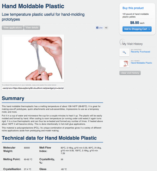
It’s interesting to see how this page differs from other sites that sell moldable plastic. Elsewhere, you just see a picture of the product in a jar. Inventables shows it in use by human hands.

Elsewhere, it’s called simply “Moldable Plastic.” Inventables adds a helpful descriptor, calling it “Hand Moldable Plastic: Low temperature plastic useful for hand-molding prototypes.”

Elsewhere, the only specs listed are the size of the jar it comes in: “3.5×3.5×3.8 inches; 13.8 ounces.” Inventables gives you stats on the actual substance, including Crystallisation Temperature, Viscosity, Melt Flow Index (whatever that is).

ZKThat level of detail, combined with a curated product mix, is how the site competes with bigger retailers. According to Zach Kaplan (right), CEO of Inventables, the goal is to inspire customers. “Part of making it accessible is making it inspiring. It has to have that design aspect to it,” says Kaplan. “Otherwise it looks like any other retail site and we’re just selling a jar of resin pellets.”

Since it’s selling a world of foreign objects, an environment tailored to discovery is key for the site. Kaplan says, “If you know what you want, then yes, you can go to Amazon and type it in and get to it. But if you don’t know what you want, that jar is not helping you.”

That’s why you get things like scientific specs and in-use photography at the site. “Our pictures are very expensive,” explains Kaplan. “I guarantee you we’re paying a lot more for pictures than other sites are paying. We’re trying to ignite your imagination. And to make you think, ‘What could I do with this?’ At other places, it’s more of a catalog than a place to go explore.”

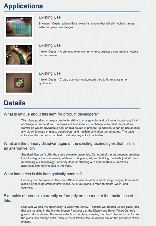
Inventables also gives examples of how others are using each product in order to spark ideas. For example, the Applications section for Temperature-Sensitive Glass (below) shows how people have used it in shower installations and interior design. The Details section explains what’s unique about the product, why it’s better than alternatives, and more.

It’s a good lesson for anyone who’s trying to compete with bigger competitors. If you’ve got a smaller product mix, you can obsess over these details in a way that big guys can’t. Customers respond to that.

Continued…

Behind the scenes: 37signals race car graphics

Jamie
Jamie wrote this on 45 comments

David Heinemeier Hansson, partner at 37signals and creator of Ruby on Rails, instant messaged me one day in December 2010.

Hey, you want to design graphics for a race car?

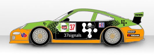
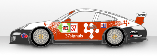
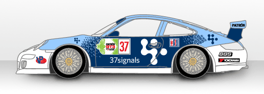
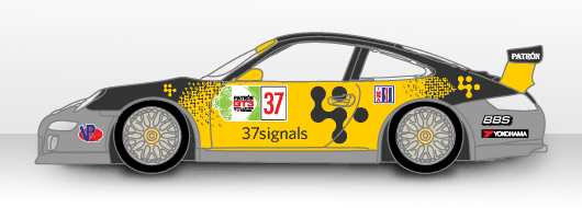
Hells yeah. Initially I had a clear vision of how I wanted the design to look. I wanted to create a pixelated affect using the iconic 37signals logo (designed by Ammon Haggerty) across the body of the car. The tricky part was the color scheme. I had really no idea where to start. Here are the various colors I tried:

Actually what’s funny is I sprinted on this for 1 week after David approached me with the project. This was right around New Year’s, so I didn’t have a lot going on. After these initial designs I got swept away with other duties (like designing materials for the 37signals Suite). I dropped the ball on the car design.

I didn’t hear from David for a while. Actually, I was avoiding the subject because I didn’t really come up with any other designs. I knew the race was in March, but I didn’t really have a grasp of the timeline to create the graphics.

Then earlier this month he tweeted:

37signals car coming alive: http://yfrog.com/gzdqdphj -- thanks to @asianmack for design! 1st race in 2 weeks @ Sebring.

I was pleasantly surprised. His car graphics guy took my concept and made it a reality. The car looks great. Good luck in Sebring DHH!

Follow David and the 37signals Racing Team today at 37racing.com.

How Makalu Interactive created the international iPhone hit RaceSplitter

Basecamp
Basecamp wrote this on 9 comments

MHRaceSplitter, a race timing iPhone app, is Makalu Interactive’s first step in transitioning from a services company to a products company. In an email, Makalu’s Matt Henderson (right) wrote, “In the course of designing and developing this product, we crossed just about every lesson in REWORK...The overall experience of designing and developing our own application, having full control of the product and its/our destiny was a game-changer for us, and there’s no going back.” Below, Henderson tells us more about the process.

Makalu — history of a service provider

Since 2001, our small team at Makalu Interactive has provided web design and development services for clients around the world. We’ve been fortunate to work on some high-profile projects, including the original CatalogChoice.org site, which gained over one million users in its first year, and the interactive game anchoring the Google & Virgin America cross-marketing campaign, Day in the Cloud. (And as a side note, Sortfolio has proven to be an amazing source of high-quality leads for us.)

The itch to create for ourselves

Despite success in client work, we’ve always imagined that creating our own products would bring deeper satisfaction, and provide the opportunity to succeed beyond the linear function of available manpower. As a team of people passionate about great user experience — and having studied the companies that make them (like Apple) and the processes through which they are made — we’ve always been curious as to just what kind of product we would be capable of making.

We’ve always identified with 37signals. It was inspiring to watch a team of people that seemed so much like ourselves transition from a web design company (like ourselves) to a highly successful products company. We also enjoyed both Getting Real and REWORK, as they articulated a refreshing view and simple approach to many of the issues we struggled with. (It was no small satisfaction to later learn that a former employee of Makalu, Mike Rohde, would end up being the designer of the REWORK illustrations.)

Not only did we try to apply the ideas from Getting Real & REWORK to our client services business, we later found them particularly valuable when making our first steps in the direction of becoming products company.

Hello RaceSplitter

Last year, we were approached by a group of people associated with NENSA.net, FasterSkier.com and FlyingPointRoad.com, interested in having a timing app developed, for recording split times and providing relative racer position during nordic ski events. With European timing devices costing $500 and up, and the previously popular Palm app going the way of the PalmOS, it seemed natural that something should be built for the iPhone.

In certain nordic ski races, similar to cycling time trials, racers start individually or in waves, separated by a start time interval — say, 30 seconds. If you’re a coach on the course, timing racers as they pass by, it’s difficult to know who’s in the lead. Although it does other things, that’s the essential problem that app solves.

We accepted the project, and got to work. The app would be called RaceSplitter.

http://racesplitter.com

It soon became apparent that the app had the potential to be an ideal first product for Makalu. It passed both the “scratch your own itch” and “focus on what doesn’t change” tests. As both participants and observers in similar sports, we were deeply familiar with the application domain, and needed such an app ourselves. And unlike an app for, say, telling the world you’ve checked in at Starbucks, a sports timing device is something that should be as relevant in five years as it is today.

We put together a proposal, in which Makalu would acquire ownership of the app, with the client keeping a minority stake. Seeing our interest, not only in the app itself, but also in building a business around the product, they accepted our offer and RaceSplitter became Makalu’s first product.

As a client provider, one always hopes to give 100% to the client, but we’d be lying if we didn’t admit that becoming the app’s owner didn’t provoke a psychological change. This was the chance we’d been waiting for; to discover what we were truly capable of.

The complete user experience — attention to detail

We poured our hearts and abilities into the product. As believers that user experience extends to every way in which a product interfaces its users, we worked as hard on things like the pre-launch sign-up site, announcement emails, even the app icon, as we did on the app itself.

The RaceSplitter signup screen

The RaceSplitter website

As emphasized in REWORK, even though our 1.0 would be minimal in terms of features, it wouldn’t be half-assed; it’d be “at-home good”.

Continued…

I wish I had another example besides Apple but I don’t…


Said several times by various 37signals people during our meetup
Matt Linderman on Mar 10 2011 23 comments

What to look for in a UI designer

Ryan
Ryan wrote this on 18 comments

There’s a thread on Quora about how to define a designer’s ideal range of knowledge.

Here are the dimensions we look at:

  1. Writing: Can they think and communicate clearly? Writing skills are critical to UI.
  2. Interface design: Can they organize elements in 2D space so that the arrangement is meaningful, clear, and instantly understandable? Can they organize elements in time (navigation, flows, steps) in a way that minimizes uncertainty and feels efficient?
  3. Product: Can they appreciate the problems and desires our customers have and turn that understanding into business value? In other words, do they know what matters and what doesn’t matter to customers and stakeholders?
  4. Development: Are they able to code their designs in HTML/CSS? Can they go further and integrate their designs into the application source code? Can they talk shop with programmers?
  5. Character: Are they a nice person with a good motivation?

Of course it isn’t necessary for everyone to kill on every point (except #5). But I think you can tell a lot about a company’s design culture by looking across these dimensions.

A Letterpressed Thank You

Jamie
Jamie wrote this on 21 comments

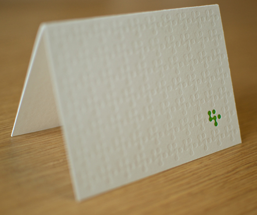
I recently designed some 37signals Thank You cards. They were printed by Rohner Letterpress in Chicago. Here’s what they look like:

thank you cards

It was a really fun to see a working letterpress. I have done offset printing before, but this was my first time seeing a letterpress in action. I made a fun little video of the press — heavily inspired by Steve Delahoyde’s awesome Field Notes videos. Original music by Sudara.


Update: Here’s a link to download the song Sudara made.

We sent out a batch for those kind enough to participate in our Holiday Toy Drive.

On the Front Lines, In the Trenches

Jamie
Jamie wrote this on 15 comments

Everyone is there to support a sale
Gordon Segal, founder and former CEO of Crate and Barrel, has the belief that each person in the corporation is there to support a sale in the store. Think about that for a second. When he says each person he isn’t just talking about the stockroom and people wearing the iconic black aprons. He’s also thinking about those designers and programmers at the corporate headquarters.

I was a designer at Crate and Barrel before 37signals. In fact, I was there for 7.5 years which is like 14 internet years right? Before Crate I was working the rounds for several years at interactive agencies during the boom times of the late 90’s. I bring this up because I worked really hard to develop skills and experience to escape those minimum wage retail jobs.

A humbling experience
Human Resources said that I had to work for 2 weeks at a retail store when I was first hired as a Graphic Designer. I thought to myself, “Bullshit!” They want to pay me a to work in a retail store? I want to start designing and making all the great things I’ve been dreaming about during the interview process! Note that I wouldn’t get to see my desk at the corporate headquarters for 2 weeks either.

I started my first day as a Graphic Designer at the North and Clybourn retail store in Chicago — complete with khakis and black apron. It was an incredible and humbling experience. I was completely out of my element. My world was MacOS not walking the floor chatting with customers. If you’re ever been in a Crate and Barrel store you’ll know that they’re wonderful to browse yet terrible to find things quickly for a high maintenance customer.

During those 2 weeks in the store I worked in every department: Kitchenwares, Furniture, Basics (everyday stuff), Dinnerware, etc. I saw a customer try to return a set of glasses he actually bought from Target. I saw happy engaged couples zapping merchandise around the store to put on their gift registry. I saw a furniture salesperson make a $20,000 sale in a few minutes. I was seeing how the business was run on the front lines, in the trenches, out of my element.

On being a better Designer
When I was in college I believed that Design can change the world. I still believe that, but I’ve become more of a pragmatist. Let’s face it, most designers out there design something to sell something else.

You can be a better designer by copying someone’s style or reading design theory books. I, however, believe the best way to be a better designer is to be on the front lines, in the trenches. Graphic Design at its basest level is to communicate something visually. The best way to communicate something better is to understand what customers need or what they’re looking for.

When I was at the Crate and Barrel store helping a woman find a set of drinking glasses I had a short conversation with her about what sort of glasses she was interested in. There are so many glasses at the Crate. In this 5 minute conversation I helped her hone in on the right glasses. Making this one $9.99 sale taught me loads more than a graphic design book had ever done. I remembered this later as I designed the UI for the website.

Customer service and support
Recently we’ve really locked in our customer support workflow here at 37signals. It’s really easy for anyone to jump in and start interacting with customers — answering their questions and helping them in times of desperation. All of the designers (Jason and David too!) are starting to interact directly with our customers. I dig that.

I know that the more sales questions I answer the better designer I’ll be. I’m on the front lines and in the trenches.