You’re reading Signal v. Noise, a publication about the web by Basecamp since 1999. Happy !

Signal v. Noise: Design

Our Most Recent Posts on Design

Design Decisions: Basecamp mobile UI

Jason Z.
Jason Z. wrote this on 23 comments

With the launch of Basecamp Mobile just a couple of weeks behind us, we wanted to take a look back at some of the design decisions we made along the way.

One of the first challenges was simply how to take the Basecamp design and make it work on a much smaller screen. It needed to look like Basecamp and be familiar to people who have been using the desktop version for years. We wanted it to perform like a native app but we didn’t want it to look like one, it was far more important that it looked like Basecamp. This was a big factor in the decision to avoid using one of the existing mobile Javascript UI frameworks.

Early inspiration: iOS

For the earliest mock-ups it was easy to rely on the excellent UI conventions of the iPhone; most of us are iPhone users at 37signals (as are many of our customers), we did a lot of testing on the devices, and frankly the UI is very good. It was a great place to start. That meant the first version had an iOS-like navigation bar at the top of the screen with the title of the screen in the center. A button on the left navigated up one level in the hierarchy (backward). A button on the right worked in the context of the current screen. This was pretty much stock from the iOS Human Interface Guidelines. Here is one of the very first screenshots of Basecamp Mobile:
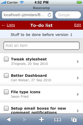
First look at Basecamp Mobile

This early mock-up was just static HTML. We used the iPhone SDK simulator even at this stage to make it seem as real as possible.

Finding our own way

We continued with this design for some time but a few problems kept coming up. We’d used the item type instead of it’s title in the navigation bar because titles can be very long. So now we had two bars that both titled the screen, but in different ways. And even using all that space it still wasn’t clear where you were. Where does the back button go? Which project is this list in?
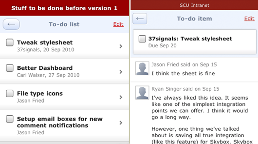
Header variations

After a few more iterations we knew something wasn’t right. We were trying too hard to squeeze our app into a navigation idea that wasn’t the right fit.

Starting over

Right about this time I happened to be in Chicago so I sat down with Ryan and Jason Fried to brainstorm some new ideas. We were sure that the iOS style navigation bar wasn’t going to work. We had to be able to show a lot more information than it was capable of—especially since titles were often much longer than the available space offered (usually just a word or two). Here are the pieces that needed to be included:

  1. Back button
  2. Title of the screen or item
  3. Name of the project
  4. Context actions (Add and Edit)
  5. Account theme (header color)

I went immediately to work quickly sketching a single header with more dense information.

Continued…
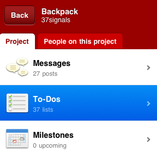
Providing great user experience with feedback

Jason Z.
Jason Z. wrote this on 22 comments

Feedback is an essential part of software user interface design. It’s especially true when designing applications for current mobile devices. Tapping a touch screen is less precise than clicking with a mouse. Touch screens also lack the tactile and auditory feedback of a physical key or button. Slow, unreliable cellular data access adds to the confusion. A user might wonder: Is the app broken or do I have a poor connection? Was my tap registered or did my fingers miss that tiny button? Making sure users get clear feedback in response to their actions and to changes in state or conditions is key to a great software experience.

When we designed Basecamp Mobile we decided to use a variety of methods to keep people informed about the current state of the app. Different conditions can require different feedback, so we had to carefully consider multiple types of feedback. Here are some examples:

Touch

It was important for us to make taps in the app feel responsive. Even if there could be a delay before the associated action executed it was essential that the user knew the tap was successful. Anything that can be tapped in Basecamp Mobile has a selected state that highlights the item immediately when the user touches the screen. Here you can see how a selected item on the project screen:

Touched state

Loading states

Basecamp Mobile is an HTML5 app that uses local storage to cache both content and the app itself. The app runs entirely in the browser, rendering HTML with Javascript and loading only your account content from the server when needed. Each screen has a number of states depending on the status of the screen’s content. A single loading indicator wouldn’t cut it—the feedback had to be appropriate to each situation. Here are some of the states we had to consider in the design:

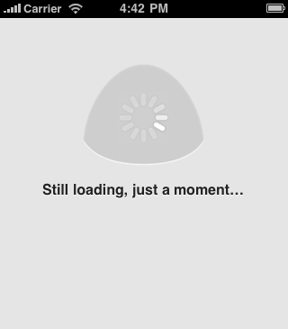
Initial load

Basecamp Mobile is loading assets the first time you run it or when the local cache is empty. The large animation is the only element on the screen making it the focus. The lack of any other UI elements makes it clear that the only option here is to wait. Because people see this before they see the app, it’s even more important that we let them know what is happening.

App loading state

If this initial load is taking too long we let the user know. After a short wait, the app reassures people that it’s still working.

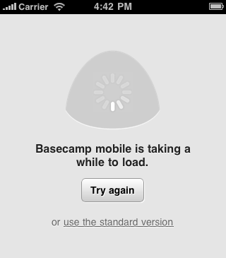
Slow loading state

If the screen still doesn’t load after a few more seconds the app offers some other options: Refresh the browser and try again or try the standard version. The latter option is useful for users who may be attempting to load the mobile optimized version on an unsupported device and need the option to switch back to the normal version.

Very slow loading

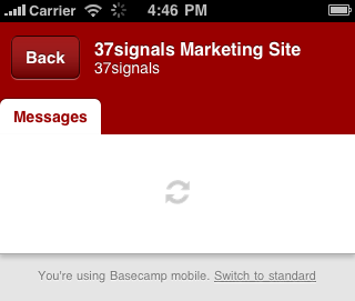
Loading content

In the next state, the app has loaded and the UI is now available, the app is only loading content now. The user can always cancel the action and go back to the previous screen. You’ll see this the first time you load a screen that you haven’t loaded before like a newly posted message.

Cold cache loading

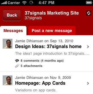
Refreshing content

Basecamp Mobile caches screens as you visit them so going back and forth between them is nearly instant. Because the data could be old we need to check the server for changes, new items, new comments, etc. The screen might be perfectly fine, or it might need to load in changes. While this is happening we show a small, less prominent indicator. The page is fully functional but we want to let the user know that we’re talking to the server. This indicator isn’t in the user’s face or in the way of what they’re doing. It’s just a notice that the app is working and if you’re expecting something new, we’re checking. You can see the spinning icon in the upper-right of this screenshot:

Syncing indicator

The icon actually duplicates the functionality of the browser’s own loading spinner (visible in the top toolbar in the screenshot above) but we felt like people were likely to ignore or completely miss it. The approach brings the loading indicator a little closer to the action without making it more intrusive.

Loading previews

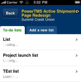
We took a similar approach with the To-do Lists screen. For each list we wanted to show the first few items on it. This makes it clear these are to-do lists and helps people identify the one they need. The previews load after the page is available because the content is helpful but not essential. A very subtle effect doesn’t distract but makes it clear something is happening. A series of spinners would have overwhelmed this screen, but the subtle gradient shine moving over the word “loading” informs without distracting.

List preview loading

Final thoughts

Presented like this it may appear that the app is just a series of waits, it’s not. Most of these indicators are actually on the screen for just seconds, but that is sufficient time to quiet a user’s doubts and ensure they know things are working. It feels great to click through the app and always feel like you know what’s happening, that things are working.

We use prominence of these indicators to tell people how important it is that they wait. The amount of surrounding UI is a clue about what else they can do if they don’t want to. You certainly have to wait for the app, itself, to load. But you can pass right by a To-do list that’s fetching a preview of it’s items. Just the right UI feedback makes sure users know this without having to think about it.

Behind the scenes: Fun little Basecamp Mobile video

Jamie
Jamie wrote this on 32 comments

Sam Stephenson asked if I could shoot a fun little video announcing Basecamp Mobile. This was on a Tuesday, and the mobile app was scheduled (at the time) to launch on Friday.

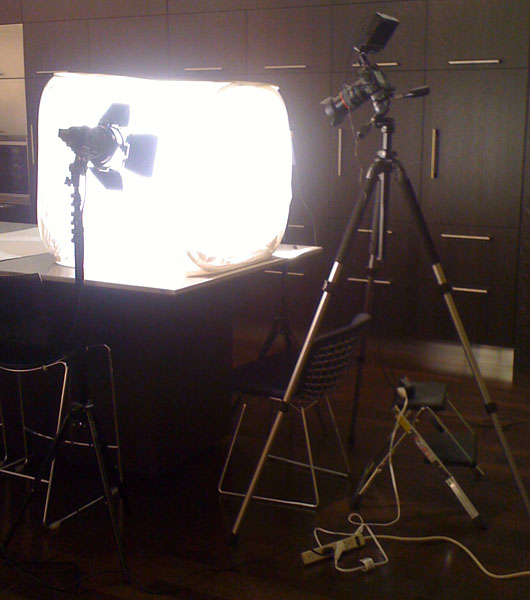
We have a Canon 5d Mark II at the office for general photo and video. Steve Delahoyde (video genius) at Coudal Partners graciously lent us his lights and light tent for the shoot. Here’s what the rig looked like (set up in our kitchen).

The direction

I wanted the video to be more about Bascamp Mobile supporting many devices rather than showing off the interface. The video had to be short and it had to tell what I thought was the most important story: You can use Basecamp on your iPhone, Android, Blackberry Torch, and Palm Pre 2.

First take

An initial idea we had was to show a hand passing a different phone across the screen: iPhone, Blackberry, Nexus One, etc. The idea that Basecamp could run on all these devices took too long to get across.

Out of focus

The better idea was to focus on the iPhone — make it seem like this is a Basecamp for iPhone spot. Then at the end we would show that Basecamp was also available on these other devices. Jason Fried had the idea to show different hands showing all of the phones.

The only problem was that the other phones were out of focus. No matter we had the idea down, we just needed to reshoot it.

Continued…

One of the things about design that makes it such a joy is that it requires balance. If elements are too large, each change will be more expensive than it needs to be. If elements are too small, changes will ripple across elements. And optimizing the design takes place against the backdrop of an unpredictable stream of changes.


Kent Beck on Coupling and Cohesion

CSA: A fantastic web site

Jason Fried
Jason Fried wrote this on 30 comments

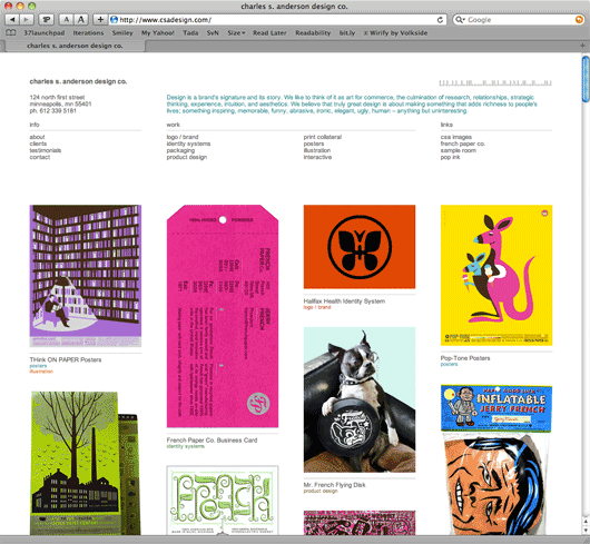
The new Charles S. Anderson Design Co. site is near perfect*.

CSA home page

It’s a beautifully simple and clear departure from the overtly complicated designs that you’ll often find when you browse design firms, architecture firms, and, most notably, photographers’ sites.

The new CSA site confidently says: We know what we’re doing. When you’re this good you don’t have to show off.

No hovers, no lightboxes, no scrolling images, no flash, no unnecessary clicks, nothing fancy at all. It’s presented clearly, directly, and without stuffy ceremony. The latest fad, technique, or technology is nowhere to be found. They’re comfortable in their own skin and it shows.

It’s effortless. I just love it.

Click on a project and you get a straightforward page with the work down the middle and the details in the margin. Each project has its own URL and is easily sharable and printable. CSA’s address and phone number is on every page. Just plain smart.

The copywriting is clear and it has purpose. It’s not too serious, too clever, or too cute. It’s plain english, yet colorful where it matters. It wants to be read. This kind of writing respects the reader.

Whenever someone asks me for an example of a site designed by someone who understands the fundamental strengths of the web, I will point to CSA’s site. This is the example.

* I’d bump up the font size a bit.

If you hold out with your vision a little bit, it’s like a cake being put in the oven. The scene doesn’t work immediately, you have to bake it a little bit. It’s unfair, when you begin to create a shot, say, or a scene, that it’s going to immediately be like those beautiful scenes in the movies. It needs a little bit of time to mature. It’s like taking the cake out without letting it be in the oven for more than a minute. Like, oh no, it’s terrible. So you have to be patient, and then slowly everyone starts to see that the ideas are right, or make the corrections. You have to battle the lack of confidence by giving the scene the chance to solidify.


Francis Ford Coppola on directing and collaborating. It’s as true for directing products as it is for directing scenes. Source.

Designs that simplify: Master Lock's Speed Dial lock and John's Phone

Matt Linderman
Matt Linderman wrote this on 21 comments

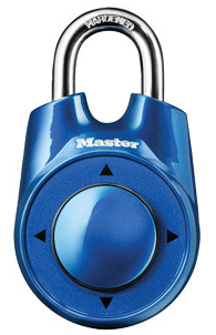
lockFast Company has a list of 12 of the Year’s Best Ideas in Interface Design. Two neat items there:

Master Lock’s Speed Dial combination lock reinvents an object that’s remained static for decades. It opens on up/down/left/right directional movements which are more intuitive than numbers or alpha-numeric code and easier for folks who are elderly or have disabilities.

In “How Do You Reinvent Something as Common as the Padlock?”, Lea Plato, lead designer of the lock, explains the design process.

Electronics in general hint a lot at directional movement. We use that kind of movement all the time in all different things, whether it’s volume control or play and fast forward. Even way back, the VCR used directional symbols to show what you wanted to do. I think being around technology everywhere—and it hinting at directional movement—played a part in the actual function of the lock. You just remember directional movement more easily. It’s more intuitive than numbers or alpha-numeric code.


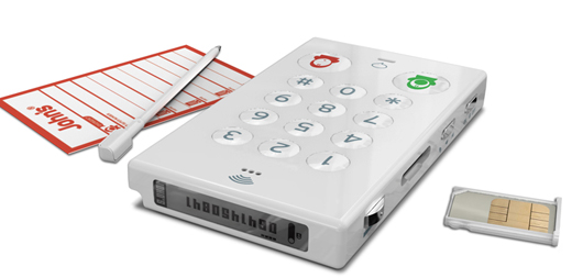
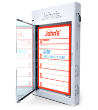
John’s Phone is a great example of underdoing the competition. It’s a cell phone that makes and accepts calls. That’s it. The phone even includes a store-it-inside-the-phone paper pad and pen for jotting down numbers.

phone

paperObviously it’s a poor fit for most folks, but it carves out a nice little niche for people who just want a phone that gets out of the way. Plus, it seems great for toddlers in a “My First Phone” kinda way. More details at Fast Company.
no-go.png

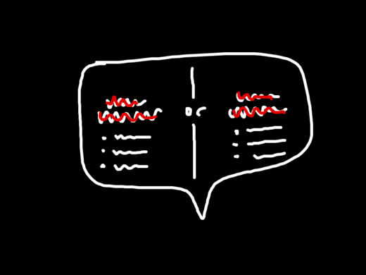
Rejected design idea. Required someone to think too far ahead. Made something simple appear complex.

Jason Fried on Jan 18 2011 16 comments