You’re reading Signal v. Noise, a publication about the web by Basecamp since 1999. Happy !

Signal v. Noise: Design

Our Most Recent Posts on Design

Bad Rap

Jamie
Jamie wrote this on 32 comments

I’m tired of hearing “Android seems cool, but the apps just don’t have that same polish as iOS ones.” Yes, there are duds on Google Play (their App Store). But there are duds in Apple’s App Store too. Here are some Android apps I’ve been using that feel “as good as iOS”

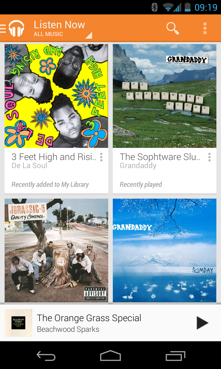
Google Music. Google Music’s All Access (their new all you can eat music subscription service) is really nice. I love how my uploaded music lives in the same Library as their store’s music. Radio feature is great. Search, of course, is pretty good too.

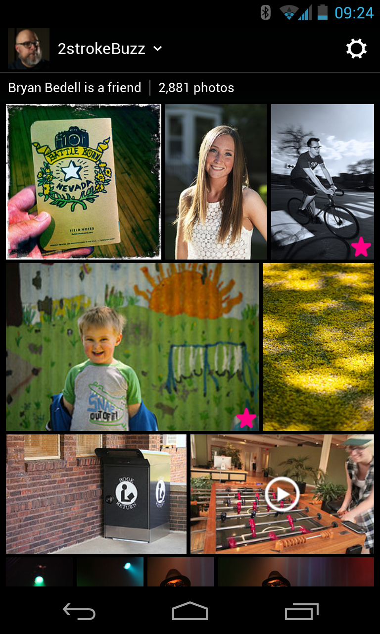
Flickr. They made a splash last week with their web app redesign. The new Android app design brings it up to the same level as their iOS app. It’s very nice.

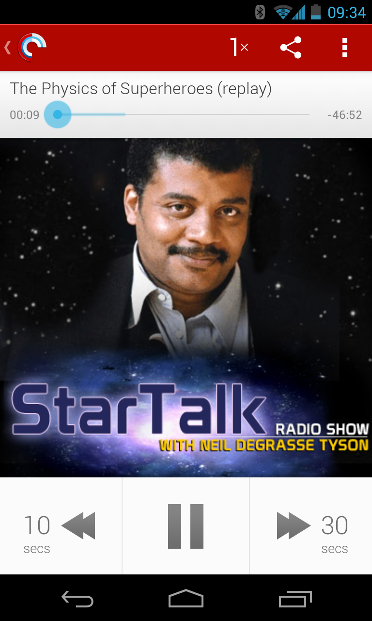
Pocket Casts. When I’m not using Google Music I’m using Pocket Casts. If you like listening to Neil deGrasse Tyson’s voice, this is the app for you.

Press. I’m an RSS guy. I know that’s not cool anymore. I’m sad about Google Reader. I use Press every day to catch up on interesting stories across the web. Really nice app.

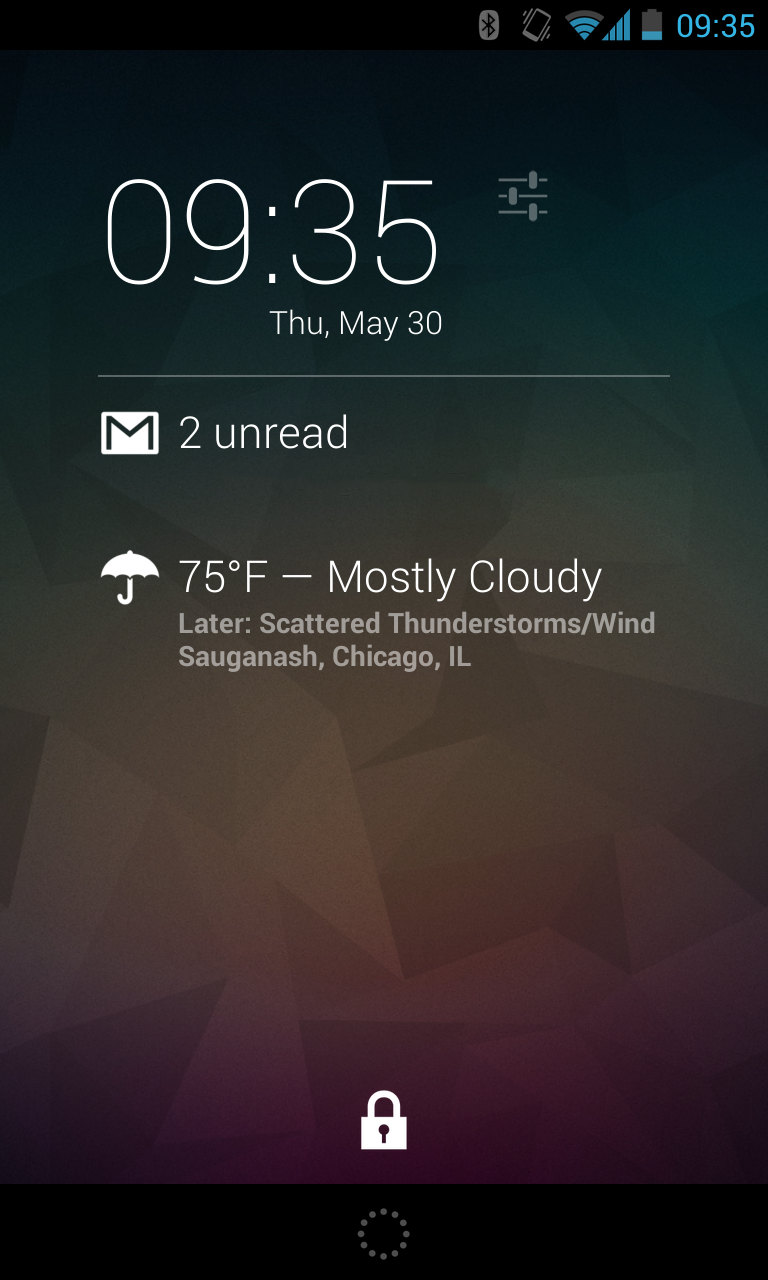
DashClock Widget. Android’s nice because you can run apps on the lock screen. DashClock gives me information without having to drill into apps.

Continued…

Don’t have the right gear? Make it.

Shaun
Shaun wrote this on 27 comments

I’ve been working on some video tests with the iPhone and I needed to mount it on tripod for some steadier shots. Some folks in the office had good things to say about the Glif from Studio Neat, but the only one we had lying around didn’t fit my phone and sat kinda goofy on our tripod plate. So, I did something I wouldn’t have imagined possible a few years ago. I printed a new one.

Continued…
chrome-buttons.png

Recent versions of Google Chrome on OS X mangle native input buttons. I don’t know precisely when it started but no amount of CSS brute-force seems to correct the text alignment. Have you found a work-around? Do you know a little birdie on the Chrome team?

(Update: Paul Irish kindly responded and filed this bug on the Chromium project.)

Jason Z. on Apr 25 2013 6 comments
Screen Shot 2013-04-18 at 12.42.44 PM.png

There’s a flash flood warning for all of Chicago today. Unfortunately there’s water in my basement (like other Chicago home owners)...

The flood fixing company U.S. Waterproofing has a cool feature on their website. Look at who we’ve helped in your neighborhood. As you can see, they get around! Gives me confidence to give them a call—which I might do right now.

Ferruccio-Laviani.jpg

“For the modern audience, the fluidity of objects in Robert Lazzarini’s body of work, for example, immediately registers instead as having been run through the computer and messed around with. As a nod to this sea change in perception, Italian designer Ferruccio Laviani has created the brilliantly disorienting Good Vibrations storage unit for Fratelli Boffi.” Read the full article.

Jason Fried on Mar 15 2013 6 comments
fantastical.png

I love Fantastical but missed having a quick way to find out today’s date, a feature the native iOS calendar app provides with a special app icon that changes each day. To work around this Fantastical offers a clever hack: an option to display the current date as a badge on the app icon.

Michael Berger on Mar 12 2013 20 comments

Since copywriting is interface design, you can do an awful lot of great design in a text editor. Don’t worry about where things will go, or how they will fit. Worry about explaining it clearly and then build the rest of the interface around that explanation.

Jason Fried on Mar 7 2013 15 comments

A loose rant on motivation and evaluation

Jason Fried
Jason Fried wrote this on 16 comments

In our industry, you’ll often hear people say things like “if someone can’t figure it out in 10 seconds then they’re gone.” Or “I checked out the site and I couldn’t figure out what they did so I left. Terrible design.” Or “if it takes more than a couple sentences to explain it then it’s not simple enough.” Or “too much to read!” Or “there are too many fields on this form!” Or “there are too many steps in this process.”

I’ve said some of these things in the past, so I understand the knee-jerk impulse that lead to these sorts of reactions.

However, something’s usually missing from these assessments of the situation: The actual customer’s motivation. How motivated is the customer to solve their problem? What are they here for?

If you’re just evaluating something purely on a design-principles basis, then it’s easy to be binary about it. Good, bad. Too slow, not clear enough, confusing, whatever.

But it’s lazy to evaluate things that way – and trust me, I know, I’ve been lazy about it in the past. I’ve just recently come to remember that you have to factor in motivation.

How motivated is the customer? If your motivation is to evaluate a design, how can you accurately comment on whether or not it’s good or bad unless you understand the customer’s motivation? Their motivation isn’t always to get in and get out as fast as possible.

Customers come to learn something, research something, consider something, buy something. If they are motivated, they may not mind spending five minutes reading. They want to read, they want to know. They’re OK investing their time to find something out if they really care about the answer.

For example, while a longer form – one that a designer might cringe at – might lead to fewer trial signups, it might also lead to higher-quality, more qualified leads. A longer form could weed out the people who are just poking around from the people who are really motivated to buy.

Is clearer better? Yes. Is brevity better? Not always. Is speed important? It depends. How much detail is required? Just enough? Should you make it easier for people to get better answers sooner? Yes. But that doesn’t mean every question demands a 10 second answer and that doesn’t mean every form needs to be three fields or less.