You’re reading Signal v. Noise, a publication about the web by Basecamp since 1999. Happy !

Signal v. Noise: Design

Our Most Recent Posts on Design

start-600x750.jpg

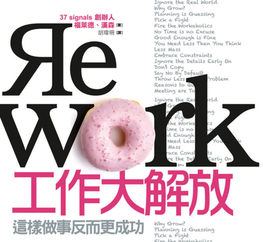
startNejc Polovsak remade a REWORK illustration (original at right) in 3D. It was an hour from concept to finished design. He writes, “I think it’s a good habit to start making things as soon as you get the idea, take an hour and start working on it. Usually when you just write it down in your to-do list it never gets done and usually the excitement is never so intense as the first time. So just start and create/design/do stuff already.”

Matt Linderman on Jan 14 2011 15 comments

Refactoring for designers

Ryan
Ryan wrote this on 35 comments

Designers sometimes use the word “refactor” in a loose way. I think they overhear the word from programmers without getting the precise meaning. This article will introduce the term to designers so they can gain the same advantages that programmers have from a clear understanding.

How do designers loosely understand refactoring? Many take it to mean “rearranging” a design or “adjusting without completely rethinking” it. Refactoring actually means something else. It means changing the way a design is built without changing the way it looks from the outside.

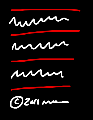
Here’s an example of a refactoring. Let’s say there is a list of elements on a page and we want a dividing line above and below each element. Below the list there is a copyright footer.

Sketch of a list of elements with borders

We could implement this design with the following HTML and CSS:

Continued…

There is no place for just shitting all over other people's work

Jason Z.
Jason Z. wrote this on 143 comments
“Shit from the fucking Mac App Store, ‘designed’ by people who think they get interface design.”

That’s the byline for Read the fucking HIG, a blog that pretends to expose apps in the Mac App Store which violate Apple’s Human Interface Guidelines. Let’s talk about what it really is: a anonymous coward’s collection of flippant, vulgar, and vicious rants directed at the result of other people’s hard work.

Designers want to assert that they’re more than just window dressers. The design community is full of cries that clients don’t understand our UI designs are carefully crafted user experiences built by caring professionals who rely on their experience, taste, guidelines, research, and testing to champion the user.

But here we have a blog by someone who seems to care about good design making juvenile comments about how ugly these apps are—based only on screenshots. That’s right, “Read the fucking HIG” doesn’t even bother to download and use the apps (well, unless they’re free). A screenshot in the App Store is all that’s needed to determine what is utter shit unworthy of the Mac App Store, really, of existing at all.

This kind of drive-by critique is sadly common. Missing are constructive commentary and suggestions for how the designer can make their app better. All the poster can muster is a knee-jerk reaction to the superficial aesthetics and a couple of f-bombs. Done! It adds nothing to the conversation and dimishes the value of design. How can we expect our clients or users to respect the care we put into design if we don’t respect it ourselves? Instead of considering what went into the design, we point at laugh at someone’s “terrible design”, retweet and reblog then go on with our superior existence.

“Where the heck were you when the page was blank?”

The above quote by legendary copywriter, Paul Butterworth, was cited frequently during critique sessions when I was in school. Looking at the end product it’s impossible to know the journey that the designer took, to appreciate what went into it. You don’t know about the constraints, the compromises, or external forces that shaped the design before you. Certainly the end user is not going to be privy to those details either, but as a designer critquing the work of another designer you should know there is more to it. No one is trying to make shitty software. They’re doing the best they can with the constraints they’re given and the talent they have. Not everyone is a maestro. Maybe these folks are just beginners. Is that how we welcome them into the fold? The point is, they’re making something. That’s awesome.

Hiding behind your Twitter avatar and telling the world how terrible everything is is pretty easy. It’s even funny sometimes. Putting yourself on the line and making something original is really hard work. Which one do you want to be. Which one deserves our respect and attention?
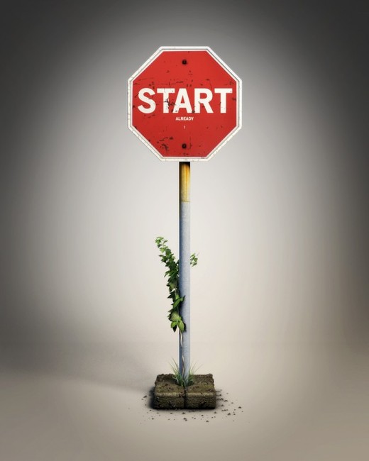
There must be some value in Comic Sans if millions of non-designers choose to use it on their signs and memos. Designers should be curious about this instead of feeling superior about it.

Very impressed by XBox 360 UI. I wish Microsoft wasn’t so silo’ed. There’s some great thinking here that should be elevated to other parts of their business: Phones, Tablets, PCs, and even software/Web apps.

A bad design is a good reminder

Jason Fried
Jason Fried wrote this on 53 comments

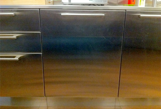
Our new office has a dishwasher. It’s sleek, modern, and silent. It blends into the stainless cabinets and countertops just perfectly. It has the same handle style as the drawers and doors to the left and right. It has no buttons or lights or anything on the outside. You don’t even know it’s there.

And this is why it’s bad.

This is it, right there in the middle:

Looks great, right? Well that depends.

At least once a week when I open it up to add a dirty cup or plate I get sprayed. Water shoots out the sides and splashes me and the floor. It’s on, but there’s no indication it’s on. It’s so good that you can’t even hear it. That’s actually bad. It’s so integrated that it doesn’t look like a dishwasher. That’s actually bad.

I used to curse it, but now I’ve made peace with it. I actually like having it around. Every time I see water on the floor, or on my shirt, I’m reminded of the subtle differences between good and bad design.

Subtle because sometimes all it takes is the smallest little thing to turn bad to good (or good to bad). A tiny bright LED light in the upper right corner could indicate ON. When the light’s on, don’t touch. When’s its off you don’t even see it. It doesn’t interfere with the overall design. That little light would make everything else — the visual design, the silence, the integration with the rest of the kitchen — worth it.

Or it could lock when it’s on, unlock when it’s off. You wouldn’t be able to unlock it once it’s on because there’s no exterior lock handle, but that seems like a small sacrifice to stay dry.

Or…

Behind the scenes: 37signals.com Redesign

Jamie
Jamie wrote this on 43 comments

A few months ago we redesigned 37signals.com — our main site. I want to share with you a few iterations and permutations I created along the way. I’ll also give a little insight into the discussions we had about each design: what we saved for the next version and what we axed because it wasn’t working.

First, a frame of reference
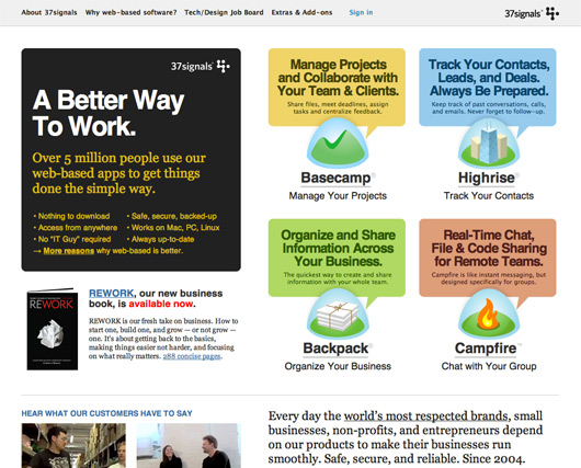
This was what the 37signals site looked like when I started this project. Each time Jason Fried and I talk about changing ANYTHING on this site he always says something like this:

Jamie, 37signals.com is VERY IMPORTANT. A ton of traffic to our app sites comes from here. We need to make sure that we aren’t abandoning clarity for cleverness. CLARITY is of utmost importance on this page.

Actually, now that I think about it he says that about everything I touch. Kidding aside, 37signals.com is a very important site. Careful consideration should be taken when undertaking a redesign.

The never-launched enhancement
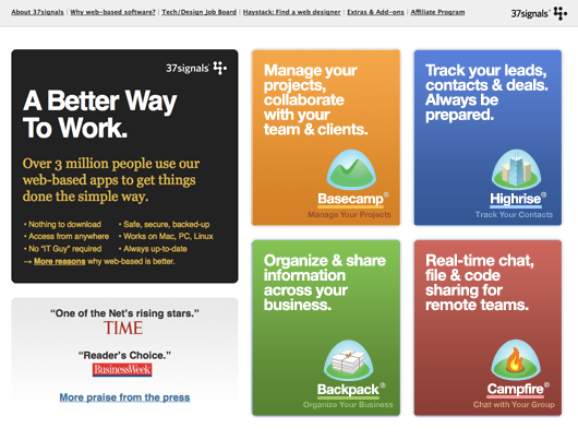
A year ago I worked on a short project to enhance parts of 37signals.com. Out of this exercise came the design below.

I liked how this design made our products look like, well, products. Basecamp, Highrise, Backpack, and Campfire are presented like shrink-wrapped packaged software. I also liked how easy it was to understand what 37signals does. We make incredibly useful software for your business. Here are our offerings.

I can’t remember why this design never launched. It could be that at the time we had bigger fish to fry. The forms that came out of it, though, would play a part in the bigger redesign project in later months.

Continued…