You’re reading Signal v. Noise, a publication about the web by Basecamp since 1999. Happy !

Signal v. Noise: Design

Our Most Recent Posts on Design

George Nakashima: "It requires a genuine fight to produce one well designed object of relatively permanent value"

Matt Linderman
Matt Linderman wrote this on 10 comments

Less is more. Form follows function. Two phrases we hear all the time. Yet furniture designer George Nakashima considered them nothing but shallow slogans. In 1962, he published a manifesto that explains why while also lamenting the disappearance of design excellence.

In a world where manual skills are shunned we believe in them, not only in the act of producing a better product, but in the sheer joy of doing or becoming. We feel that pride in craftsmanship, of doing as perfect a job as possible, of producing something of beauty even out of nature’s discards, are all homely attributes that can be reconsidered.

It might even be a question of regaining one’s own soul when desire and megalomania are rampant – the beauty of simple things…

To look for clues, we can go into the past: the moss garden and tea house at Sai Ho Ji, the wonders of stone and glass at Chartres, the dipylon vase. These are all examples of excellence that can go unchallenged but also unnoticed. They are all formed inwardly with a nearly impersonal experience. Compared to our day, with its arrogance of “form-giving,” the shallowness of slogan design such as “less is more,” “machine for living,” or even “form follows function.”

In proportion to the flood of consumer goods, we are probably at one of the lowest ebbs of design excellence that the world has seen. It requires a genuine fight to produce one well designed object of relatively permanent value. One of the difficulties is the lack of integration between the designer and the producer – the evolvement of material and method into a well conceived idea. Big city architecture has reached such a profound state of boredom that man might unwittingly destroy it in one last tragic gesture – without humor. Sentimentally again, we can look back to the thirteenth century, when almost every hinge was a museum piece. Where there was a touch of greatness in the majority of acts and conceptions.

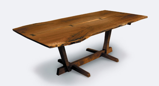
Some Nakashima designs:
Continued…

Simply put, the design education system today is failing many aspiring young students. Some of the design schools they’ve attended have no real design process education, while others have only process education.


Gadi Amit, fastcodesign.com blog

[Podcast] Episode #24: The new 37signals office

Matt Linderman
Matt Linderman wrote this on 5 comments

Time: 11:20 | 12/13/2010 | Download MP3


Summary
A talk about the new office space: How’s it working out so far? What was it like being on the opposite end of the client/designer (or, in this case, architect) relationship? What’s the “right” amount of space for now and years from now?

Transcript
The transcript is also available now. Here is an excerpt from Jason:

We wanted to be surrounded by high quality stuff, because I believe that the things that you work around, the environment that you’re in, have a lot to do with the work that you do. And if you can be influenced by things that you know somebody spent a lot of time on, and is something that was carefully considered, and it’s just the right material for the job, hopefully that will rub off on you when you build something and you design something. So, the office, in many ways, is supposed to be an inspiration for us to build better stuff.

More episodes
Subscribe to the podcast via iTunes or RSS. Related links and previous episodes available at 37signals.com/podcast.

Experimenting with responsive design in Iterations

Basecamp
Basecamp wrote this on 9 comments

Iterations was a good place for us to implement some responsive design ideas we’d been interested in trying.

As it turned out, making the layout work on a variety of devices was just a matter of adding a few CSS media queries to the finished product. The key to making it easy was that the layout was already liquid, so optimizing it for small screens meant collapsing a few margins to maximize space and tweaking the sidebar layout in the cases where the screen is too narrow to show two columns.

The CSS max-width property seems almost forgotten in the web designer’s toolbox since it wasn’t supported by Internet Explorer 6. With that restriction lifted, it’s the perfect compliment to a liquid layout letting the content re-flow naturally at a variety of widths but not expanding to the point of absurdity where extreme line lengths make reading a chore. It’s a great compromise between liquid and fixed layouts.

screen A wide view. The max-width property keeps the width of the content at a reasonable size for nice reading.

screen
A narrow view. No need for any media queries here, the browser automatically reflows the content in our liquid layout.

screen
Even narrower. The margins and padding around the content collapse to maximize space, the layout changes to a single column—this is the basis of the mobile phone layout.

Continued…

Behind the scenes: Basecamp illustration

Jamie
Jamie wrote this on 19 comments

I needed to make illustrations for all of our apps for the new 37signals Suite page. The goal was to give a general idea of what the particular app does for customers that may be unfamiliar with our products. The illustration didn’t need to carry all of the weight since there would be a text description alongside it. However, it had to be attractive and detailed enough for people just scanning the page with their eyes.

Here are the variations I came up with for Basecamp. This particular project (illustrations for all the apps) took about 8 hours. Jason and Ryan both gave feedback which helped me arrive at the final version. There was a similar process for each of the other app illustrations too. I hope this gives you a sense of how we work.


Marketing tie-in
Trying to bring in elements — hand drawn arrows and icons — from the Basecamp marketing site.

Feedback: Good first step. The 2 icons, however, make Basecamp look weak. “What!? Basecamp can only do 2 things?”


Collage background
What if there was a collage of icons that would hint at everything Basecamp could do? It’ll be abstract, but maybe that’s OK. I can picture how the other apps would look like too. The icons can act almost like a pixellated abstract background.

Feedback: The idea is strong enough that I make similar illustrations for Highrise, Backpack, and Campfire to prove the concept. The page with the finished illustrations looks great. Unfortunately they are too abstract and also messy looking. “I thought these products were supposed to help me get organized, etc. It looks a bit chaotic.”


Literally: Project management
Jason starts throwing out ideas in our Campfire chat room: “How about a top down shot of people around a table meeting about a project?” To be honest I am not sure how it will turn out, but it is worth a try. Here’s a quick sketch of this exploration. I don’t spend much time giving the figures detail. I just want to prove the concept.

Feedback: This is way too hard to get right. I have to select the right ratio of men to women. I have to take into account skin color, clothing, etc. Do they wear suits or black turtlenecks? It also doesn’t look like they’re managing a project. They could be playing poker.


Literally: Project management part 2
Let’s try a folder. Most project managers I have worked with use a folder or a binder to keep relevant documents in one place.

Feedback: The folder is dull. It looks messy too.


Warmer folder
Ryan is concerned that the folder isn’t interesting. Maybe it’s the shape and color. Let me try a warmer color and softer shape. I’ll put “Projects” on the tab.

Feedback: Closer, but it is still dull. This is one of our best products and it is not exciting at all.


Add some flair
Jason and I have a quick 5 minute meeting to talk about the folder. We’ll bring back the icons. I’ll get them jumping out of the folder. I can also add some type of seal or sticker the open side to give a little more interest.

Feedback: Still way too messy.


Final illustration
I call Jason over to my computer as he is headed to the kitchen to make tea. I tell him I’m concerned about the messiness. Jason sketches a cross on a piece of paper. It’s like a coat of arms for project management. I like that idea and start working with that.

Feedback: Great! Let’s go with it.

You can’t improve a design when you’re emotionally attached to past decisions. Improvements come from flexibility and openness.

The IV drip of pleasure you get from solving one little problem at a time

Matt Linderman
Matt Linderman wrote this on 16 comments

closeThe overwhelming way: Head down forever and hope there will be a big payoff at the end.
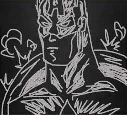
The problem: The finish line always seems like it’s miles away. You spend 99% of your time anxious and only experience joy at the end (if ever). Sometimes you’re so intimidated by the idea, you give up.

A more soothing approach: Break what you’re doing into smaller, incremental units. Then you get to celebrate each step of the way instead of waiting until the end.

Artist Chuck Close is someone who chooses this approach. He’s famous for his portraits of faces despite suffering from prosopagnosia — aka face blindness. He overcomes this by working in incremental units. He uses a pixilated approach to painting that turns faces into a grid of individual squares. In this interview, he explains why.

The fact that there are incremental units is driven by my learning disability. I was overwhelmed by the whole. How am I going to make a head? How am I going to make a nose? It’s too overwhelming. It makes me too anxious. But if I break it down into a lot of little decisions…

This was a coping mechanism I used all throughout school and everything that I did. Take something overwhelming and anxiety provoking and make it into little, not-so-scary decisions and have it be a positive experience. Because every time I completed a square, I didn’t have to wait until the end to get pleasure. I could solve one little problem at a time and the pleasure came with each one of those.

Solve one little problem at a time and you get a steady IV drip of pleasure. And that’s great motivation to keep going.

Continued…